Chapter 8 Data Visualization
8.1 bar chart
Let’s use a new dataset as an example here. In the lego_sample dataset, there are various LEGO sets, pieces, recommended retail prices, prices on Amazon, sizes, and more.
## # A tibble: 75 × 14
##    item_number set_name         theme pieces  price amazon_price  year ages  pages
##          <dbl> <chr>            <chr>  <dbl>  <dbl>        <dbl> <dbl> <chr> <dbl>
##  1       10859 My First Ladybi… DUPL…      6   4.99        16     2018 Ages…     9
##  2       10860 My First Race C… DUPL…      6   4.99         9.45  2018 Ages…     9
##  3       10862 My First Celebr… DUPL…     41  15.0         39.9   2018 Ages…     9
##  4       10864 Large Playgroun… DUPL…     71  50.0         56.7   2018 Ages…    32
##  5       10867 Farmers' Market  DUPL…     26  20.0         37.0   2018 Ages…     9
##  6       10870 Farm Animals     DUPL…     16   9.99         9.99  2018 Ages…     8
##  7       10872 Train Bridge an… DUPL…     26  25.0         22.0   2018 Ages…    16
##  8       10875 Cargo Train      DUPL…    105 120.         129.    2018 Ages…    64
##  9       10876 Spider-Man & Hu… DUPL…     38  30.0         74.5   2018 Ages…    20
## 10       10878 Rapunzel's Tower DUPL…     37  30.0         99.0   2018 Ages…    24
## # ℹ 65 more rows
## # ℹ 5 more variables: minifigures <dbl>, packaging <chr>, weight <chr>,
## #   unique_pieces <dbl>, size <chr>
lego_sample |>
na.omit() |>
ggplot(aes(x = packaging, y = pieces)) +
geom_bar(stat = "summary", position = position_dodge(.8), width = .7, fill = "#BDD5EA") +
geom_errorbar(stat = "summary", position = position_dodge(0.5), width = .12) +
facet_wrap(theme ~ ., scales = "free") 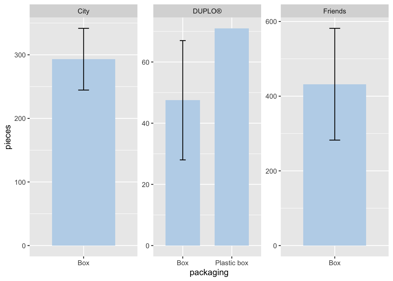
It seems that a lot has happened in the code chunk, and there’s quite a bit of information presented by the graphs.
Let’s walk through the code.
in
ggplot(), we specify thexandyaxes.geom_bar()creates the bar chart.stat = "summary"calculates the mean value of the y-axis variable, which ispiecesin this case.position = position_dodge()separates the bars to avoid overlap.width =sets the width of the bars. Ifwidth = 1, the bars will stick together.fill =can be a single color (as in this example) or another variable to create color variation.
geom_errorbar()calculates and displays the standard error on the graph.- The
width,fill, andpositionarguments work similarly to those ingeom_bar().
- The
facet_wrap()separates the graphs by the variable you specify.You can use
<your variable> ~ .or~ <your variable>.The
scales = "free"option adjusts the y-axis for each graph based on its data. However, it’s not always recommended, as explained below.
Now, let’s analyze the graph. We can observe a few things:
The graphs are separated by different LEGO themes: “DUPLO®”, “Friends”, and “City”.
In the “Friends” and “City” collections, there are only data from the Box packaging method, indicating that there is no data where the LEGO is from “City” or “Friends” collections using Plastic box.
The y-axis scales differ across the graphs. Although the program automatically adjusts the scale based on the data, this might hinder important information. For example, in the “City” and “Friends” collections, the difference in pieces is harder to discern. We will explain how to address this in the scales section.
If we do not want to use facet_wrap() for separating graphs, we can use other ways to distinguish between categories. For exapmle, if we assign a variable to fill =, we can ask RStudio to fill different colors for each category.
lego_sample |>
  na.omit() |>
  ggplot(aes(x = packaging, y = pieces, fill = theme)) +
  geom_bar(stat = "summary", position = position_dodge(.8), width = .7) +
geom_errorbar(stat = "summary", position = position_dodge(.8), width = .12) 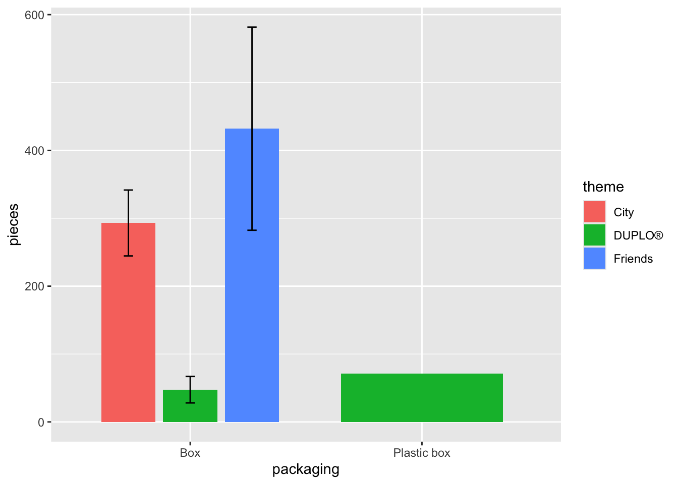
8.2 scatter plot
lego_sample |>
  na.omit() |>
  ggplot(aes(x = pieces, y = price, color = theme, shape = theme)) +
  geom_point() +
  geom_smooth(method = "lm")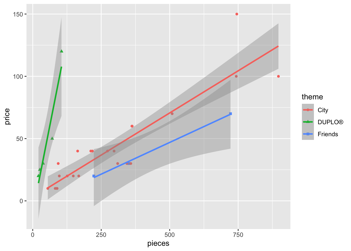
Let’s examine the code:
In the aes() section, I’ve used both color AND shape to differentiate by theme. Usually, one type of distinction is sufficient, but sometimes colors alone may be hard to differentiate. In such cases, adding another feature (e.g., shape) can improve readability.
geom_point()is used to display individual data point, creating the scatter plot.geom_smooth()adds trend lines to the data. By settingmethod = "lm", we apply a linear model, which results in a straight trend line.
Next, let’s try a different dataset: movies. This dataset is part of the openintro package and contains several datasets.
## # A tibble: 140 × 5
##    movie           genre      score rating box_office
##    <chr>           <chr>      <dbl> <chr>       <dbl>
##  1 2Fast2Furious   action      48.9 PG-13      127.
##  2 28DaysLater     horror      78.2 R           45.1
##  3 AGuyThing       rom-comedy  39.5 PG-13       15.5
##  4 AManApart       action      42.9 R           26.2
##  5 AMightyWind     comedy      79.9 PG-13       17.8
##  6 AgentCodyBanks  action      57.9 PG          47.8
##  7 Alex&Emma       rom-comedy  35.1 PG-13       14.2
##  8 AmericanWedding comedy      50.7 R          104.
##  9 AngerManagement comedy      62.6 PG-13      134.
## 10 AnythingElse    rom-comedy  63.3 R            3.21
## # ℹ 130 more rows
The dataset contains 5 columns and 140 rows, representing movies released in 2003. The columns include the movie title, genre, score (by critics on a scale 0-100), MPAA rating, and box_office (millions of dollars earned at the box office in the US and Canada.)
You can type movies in the help section in the bottom-right panel for a detailed description of the data.
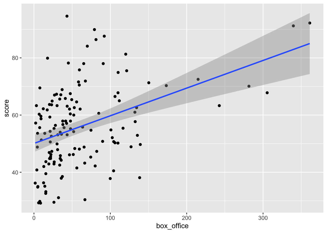
From the graph, we can see a positive relationship between the box_office and score.
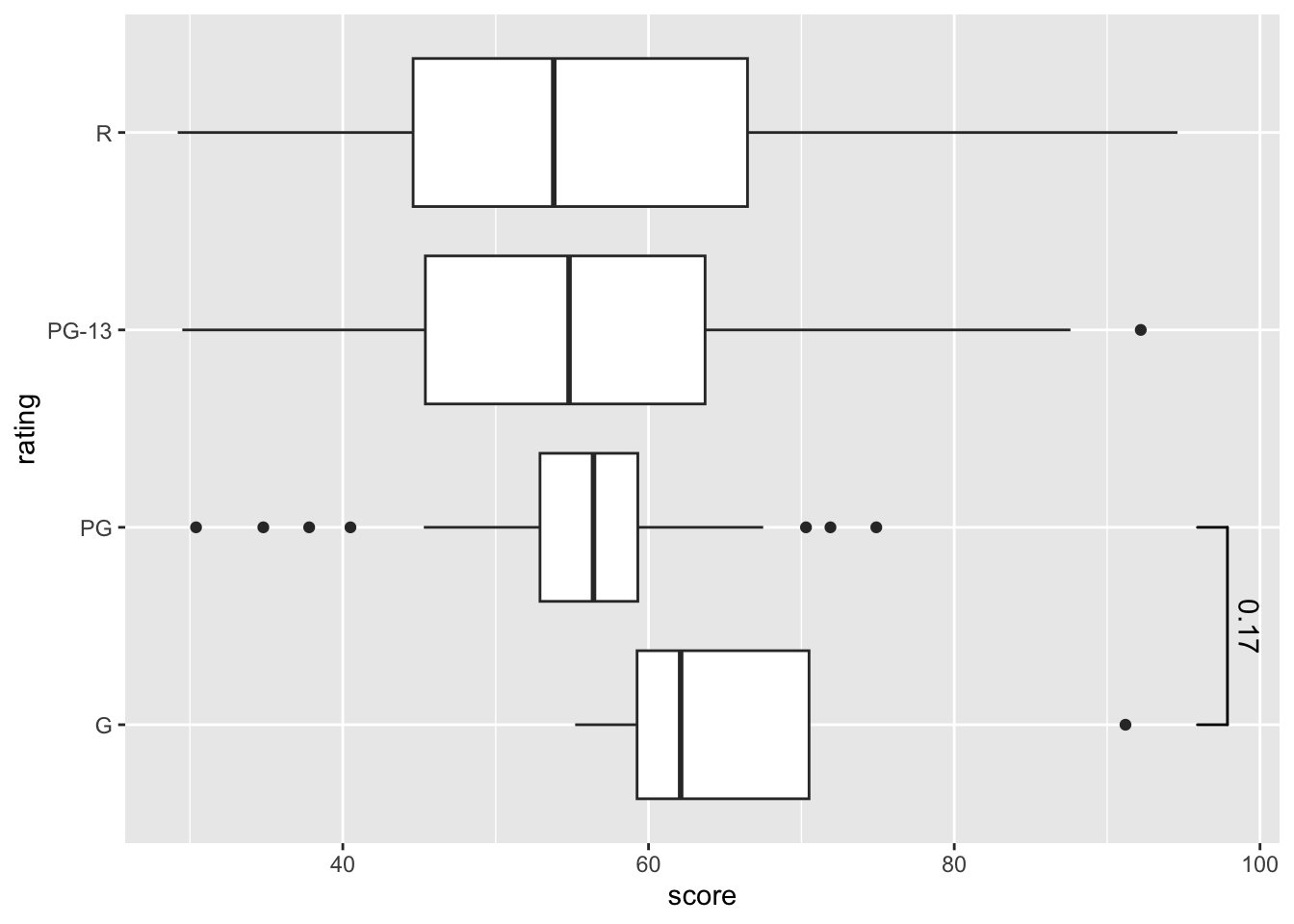
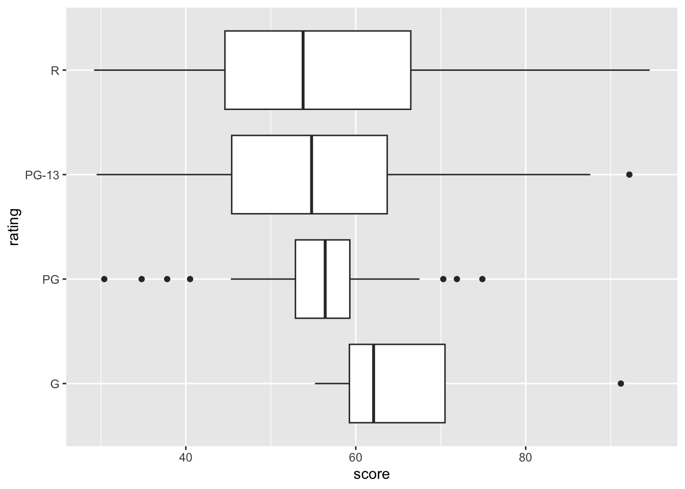
8.3 box plot
A box plot helps us visualize the interquartile range in our data. This is useful when comparing a categorical variable with numerical values.
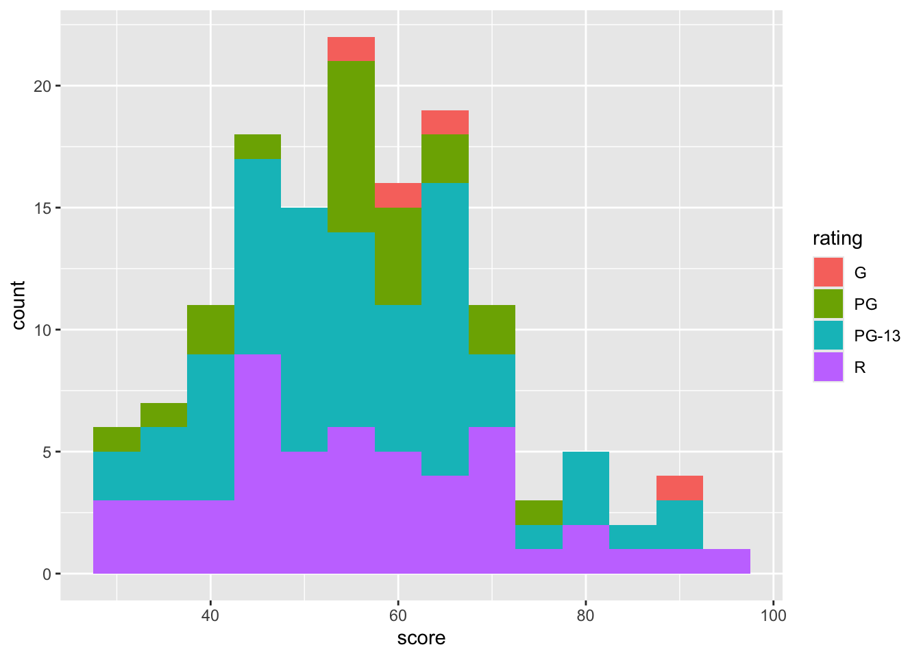
8.4 histogram
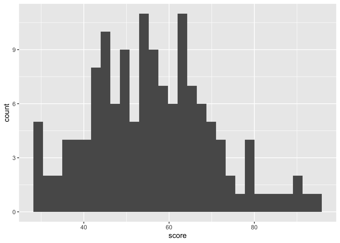
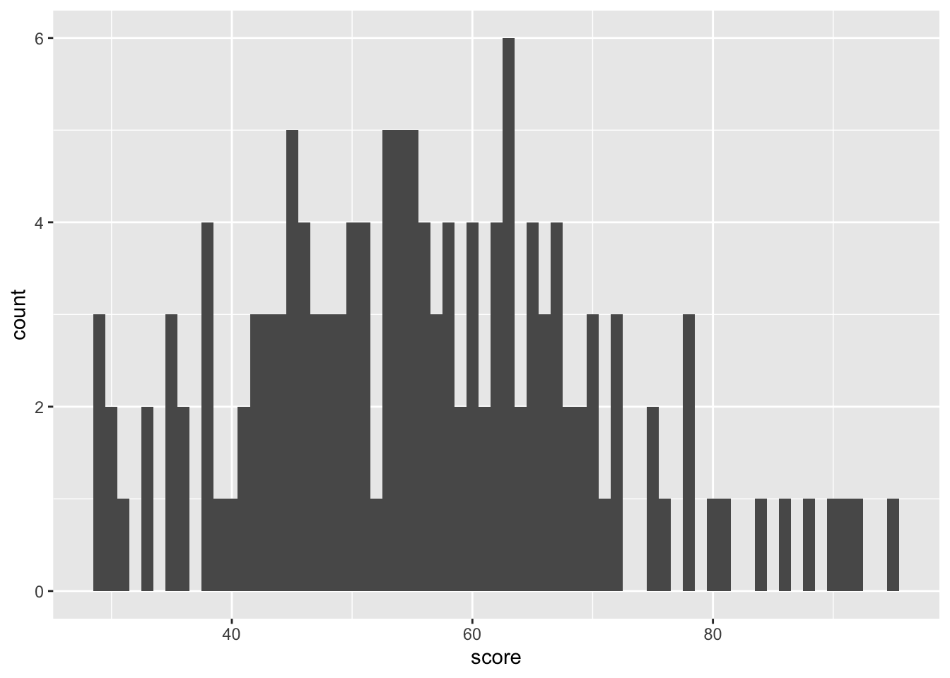
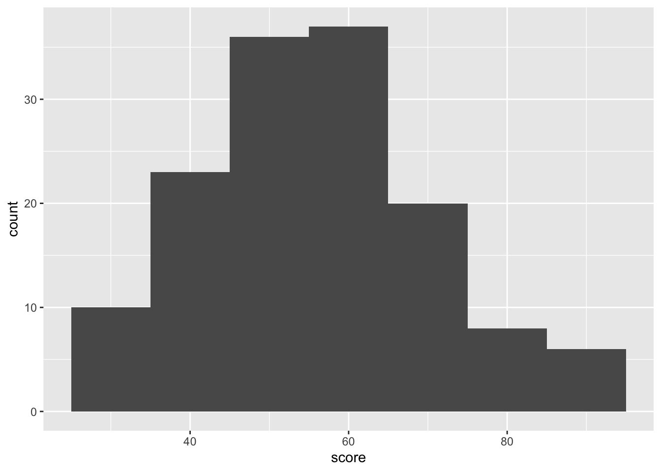
binwidth: controls the thickness of the bars, if the bars are too thin (binwidth = 1), you’ll see individual data points clearly. However, this may not be ideal for observing general trends in the data. Therefore, I recommend experimenting with differentbinwidthvalues to find what works best for your data.
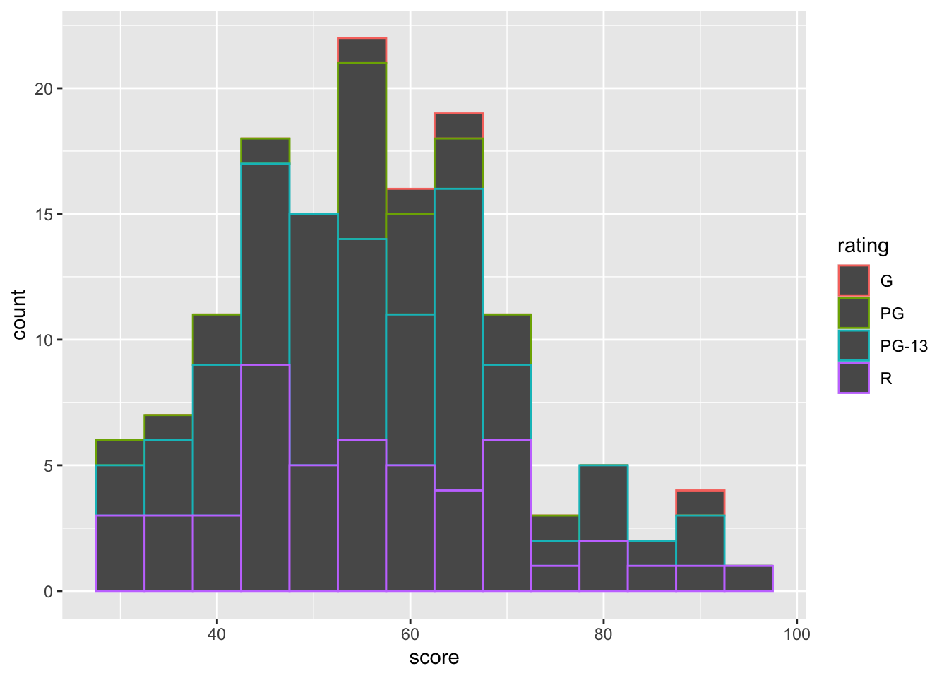
In the histogram, the color argument controls the outline color of the bar, while fill controls the interior color of the bars.
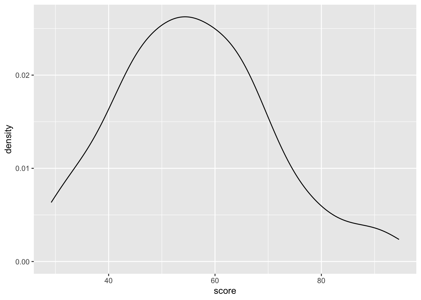
8.5 density plot
Density plots are similar to connecting the peaks of a histogram to form a smooth line, providing a clearer view of the data distribution.
We can also separate data into subcategories.
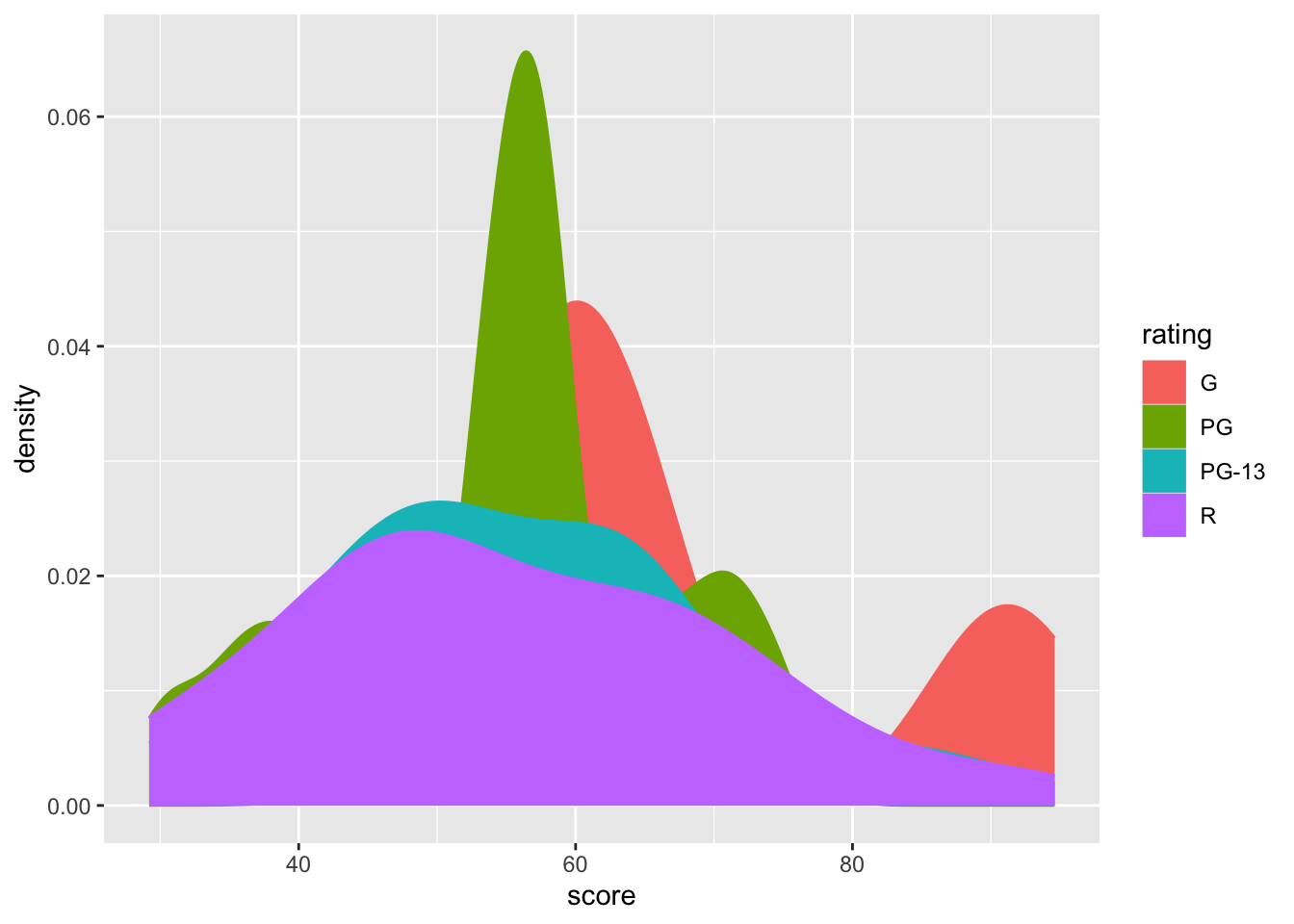
However, this graph might be hard to read due to overlapping data. For instance, the values for ratings R and PG-13 are not clearly distinguishable. To resolve this, we can adjust the transparancy of the graph.
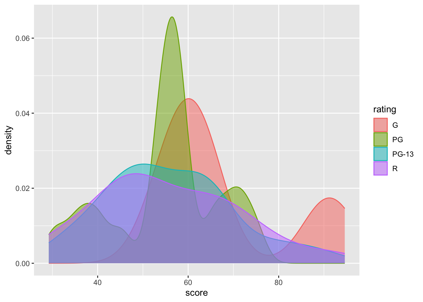
Alternatively, we can use geom_density_ridges() to further separate the data, improving readability.
library(ggridges)

movies |>
  ggplot(aes(x = score,y = rating,  fill = rating, color = rating)) +
  geom_density_ridges(alpha = 0.6)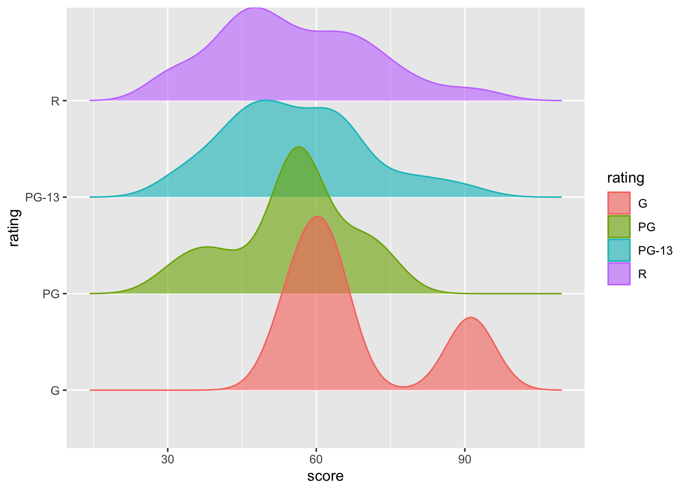
8.6 violin plot
A violin plot is another display of density plot. The operation is also easy, just change geom_density() into geom_violin().
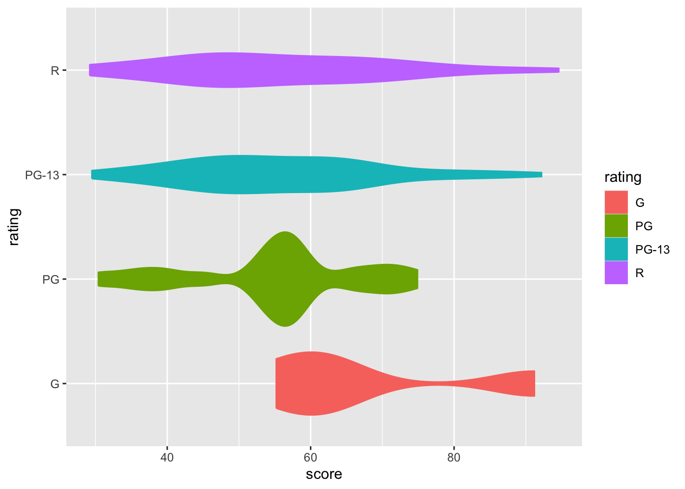
As usual, you can adjust the width and transparency of the violin plot using width = and alpha =, respectively.
movies |>
  ggplot(aes(x = score,y = rating,  fill = rating, color = rating)) +
geom_violin(width = 1.2, alpha = 0.4) 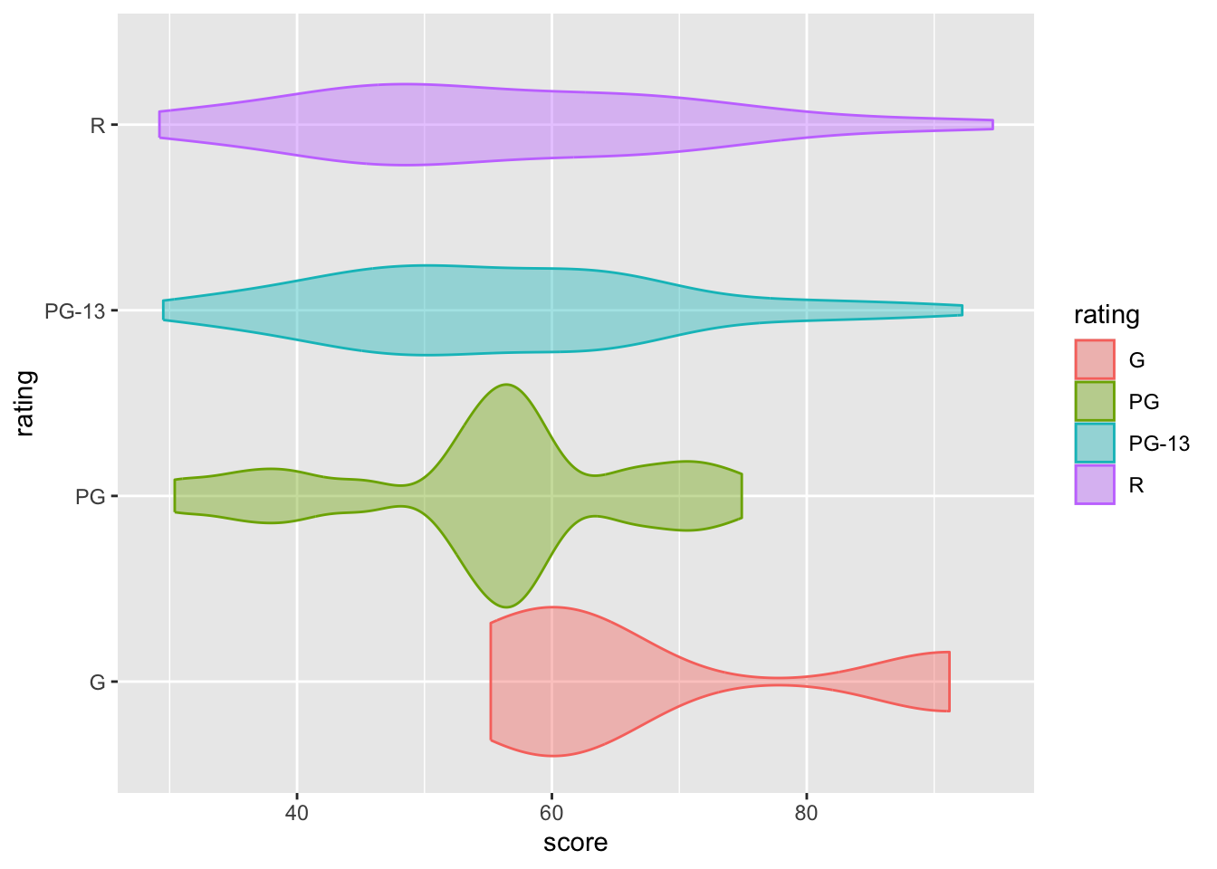
Additionally, you can add a boxplot on top of the violin plot to make the visualization more informative.
movies |>
  ggplot(aes(x = score,y = rating,  fill = rating, color = rating)) +
  geom_violin(width = 1.1, alpha = 0.9) +
geom_boxplot(width = 0.2, alpha = 0.5, color = "black") 
One flexible feature of R graphics is that they are created layer by layer. Therefore, you can see that changing the order between geom_violin() and geom_boxplot() will affect the resulting graph.
movies |>
  ggplot(aes(x = score,y = rating,  fill = rating, color = rating)) +
  geom_boxplot(width = 0.2, alpha = 0.5, color = "black") +
geom_violin(width = 1.1, alpha = 0.9) 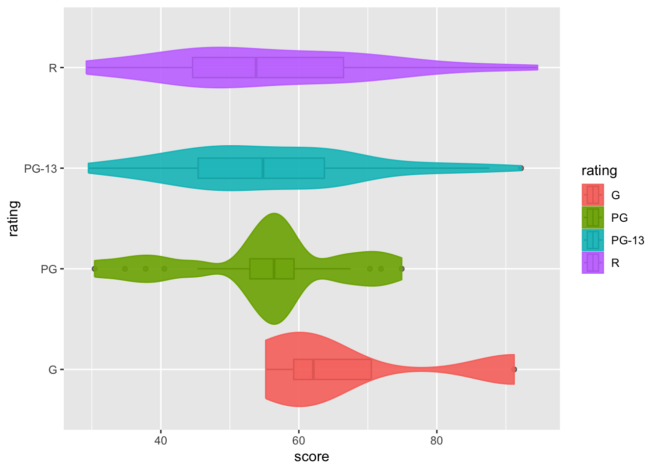
In this example, we can see that the boxplot is almost invisible, even without adjusting its transparency. This happens because moving geom_violin() after geom_boxplot() causes R to draw the boxplot first, and then add the violin plot on top. Since the violin plot is not very transparent (alpha = 0.9, almost opaque), it effectively shadows the boxplot.
Keep in mind that in
ggplot(), the order of layers matters.
8.7 scatterplot matrix
A scatterplot matrix generated by ggpairs visualizes pairwise relationships between multiple variables, displaying scatterplots for each pair and univariate distributions on the diagonal.
We will now create them using this package: GGally.
8.7.1 categorical * numeric
這邊的資料在下面才有介紹,不知道是要把介紹提前還是怎樣:D 不知道 再看看
## # A tibble: 75 × 14
##    item_number set_name         theme pieces  price amazon_price  year ages  pages
##          <dbl> <chr>            <chr>  <dbl>  <dbl>        <dbl> <dbl> <chr> <dbl>
##  1       10859 My First Ladybi… DUPL…      6   4.99        16     2018 Ages…     9
##  2       10860 My First Race C… DUPL…      6   4.99         9.45  2018 Ages…     9
##  3       10862 My First Celebr… DUPL…     41  15.0         39.9   2018 Ages…     9
##  4       10864 Large Playgroun… DUPL…     71  50.0         56.7   2018 Ages…    32
##  5       10867 Farmers' Market  DUPL…     26  20.0         37.0   2018 Ages…     9
##  6       10870 Farm Animals     DUPL…     16   9.99         9.99  2018 Ages…     8
##  7       10872 Train Bridge an… DUPL…     26  25.0         22.0   2018 Ages…    16
##  8       10875 Cargo Train      DUPL…    105 120.         129.    2018 Ages…    64
##  9       10876 Spider-Man & Hu… DUPL…     38  30.0         74.5   2018 Ages…    20
## 10       10878 Rapunzel's Tower DUPL…     37  30.0         99.0   2018 Ages…    24
## # ℹ 65 more rows
## # ℹ 5 more variables: minifigures <dbl>, packaging <chr>, weight <chr>,
## #   unique_pieces <dbl>, size <chr>
Let’s say we want to explore the relationship between the price of Lego sets (price, a continuous numeric variable) and their size (size, a categorical variable).
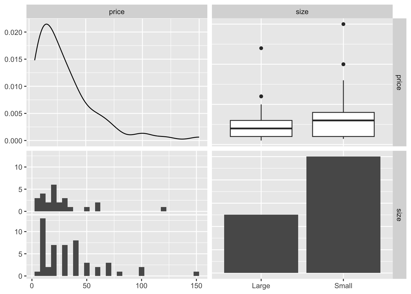
The top-left panel of the resulting plot shows the distribution of the price – a univariate plot of price vs. itself. The bottom-right panel shows the distribution of size, where RStudio counts the number of Lego sets in each category (large and small).
The top-right panel presents a boxplot of price vss size, which is commonly used for visualizing the relationship between numeric variable and categorical variable. Similarly, the bottom-left panel shows the distribution of prices within each size category, but it doesn’t specify which data belongs to large or small categories (possibly because I’m just couldn’t figure it out yet).
8.7.2 numeric * numeric
Next, let’s examine two numerical variables: the recommended retail price (price) and the price on Amazon (amazon_price).
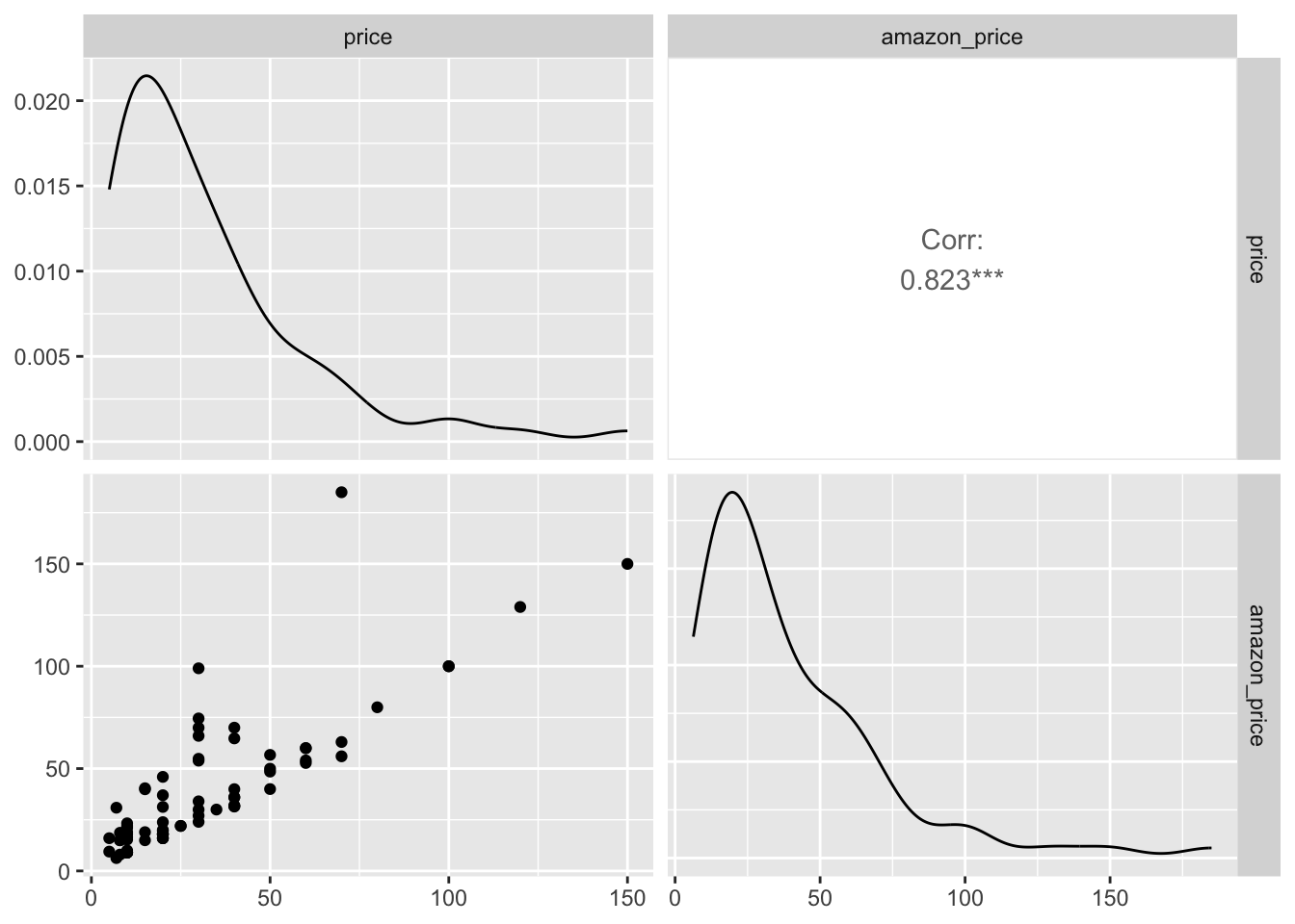
This graph differs from the previous one because both variables are numeric. The top-left panel shows a density plot of the recommended retail price, while the bottom-right panel does the amazon_price. Although the distributions are similar, they are not identical.
In the bottom-right panel, a scatter plot shows a strong positive correlation between the two prices, as reflected by the correlation coefficient displayed in the top-right panel.
8.7.3 numeric * numeric * numeric
What if we add one more numeric variable? We can take a look at the relationship between price, amazon_price, and minifigures (after converting minifigures back to a numeric variable).
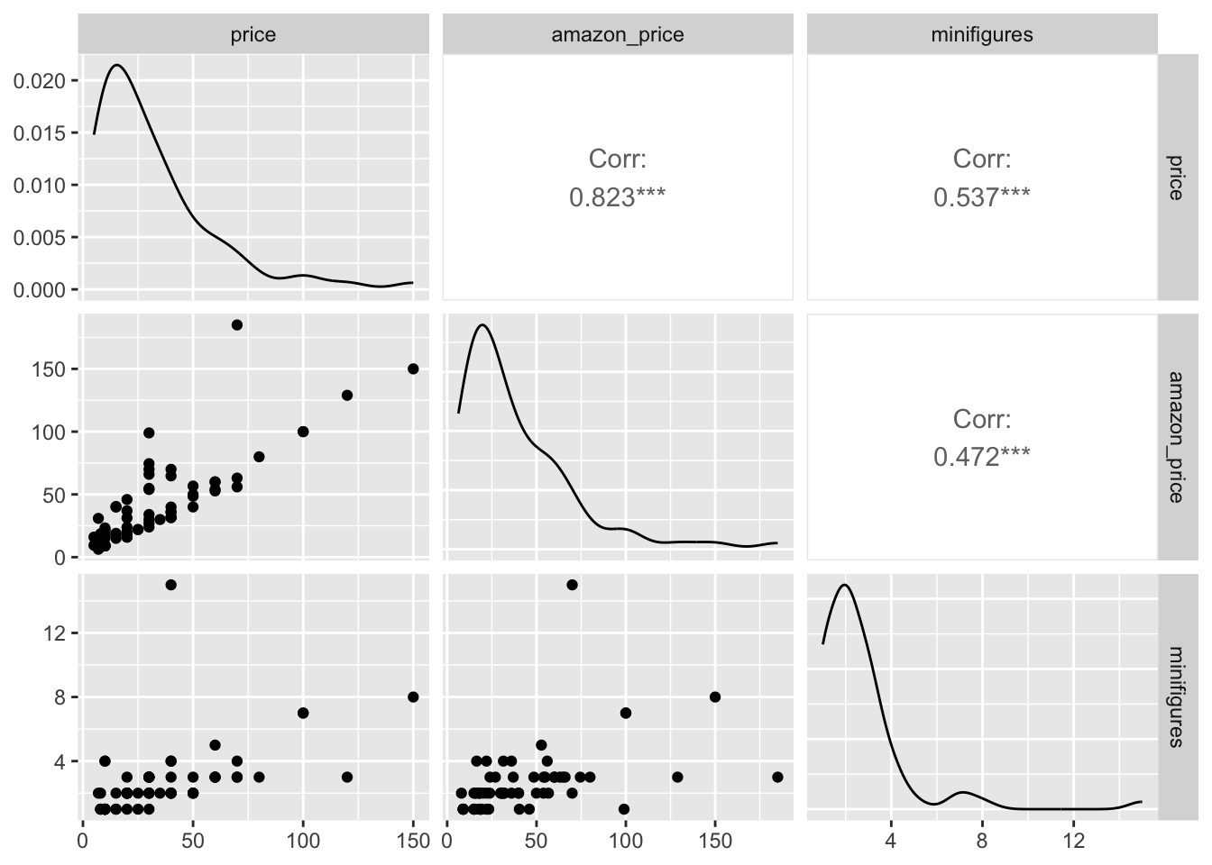
This gives us a clearer overview of the relationship between multiple numeric variables.
If we want to add more information, like trend lines or confidence intervals, we can use the following code:
lego_sample |>
  ggpairs(columns = c("price", "amazon_price", "minifigures"),
          lower = list(continuous = wrap("smooth")))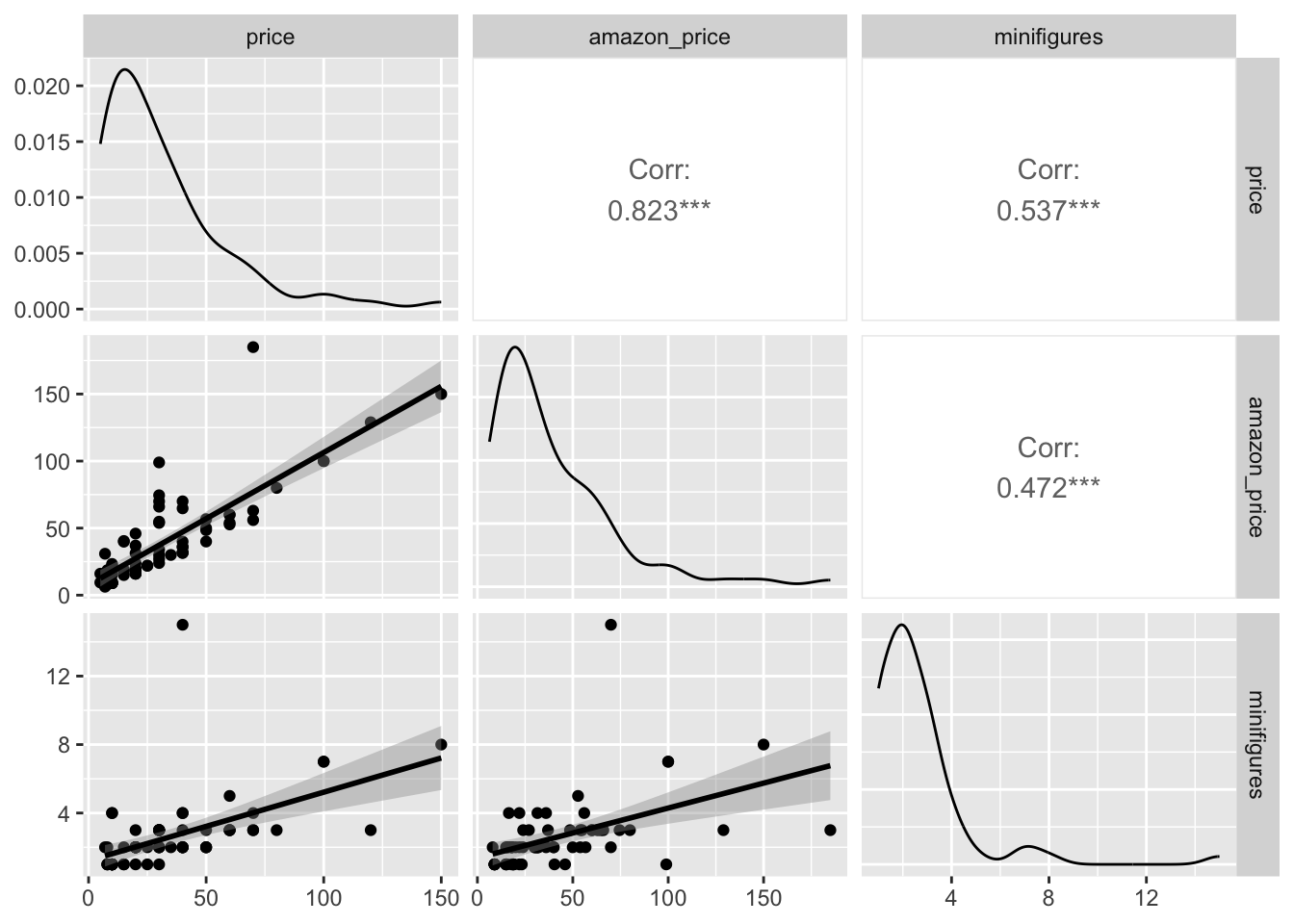
Here, we simply add lower = and specify what we want.
lower =: Controls the display of the lower part of the graph.wrap(): Helps us to specify what we want for continuous numeric variables.smoooth: Creates trend lines on the scatter plot (similar togeom_smooth).continuous =: Specifies that the data is continuous, allowing us to adjust how it’s displayed.
Note that the default correlation method is "pearson". To change this, you can add the mehtod = argument to specify another correlation method.
lego_sample |>
  ggpairs(columns = c("price", "amazon_price", "minifigures"),
          upper = list(continuous = wrap("cor", method = "spearman")),
          lower = list(continuous = wrap("smooth")))
For the upper = part of the graph:
upper = "cor": Displays the correlation coefficients in the upper panels.
8.7.4 numeric * numeric * numeric * categorical
Now that we’ve explore several ways to plot numeric variables, let’s add a categorical variable here. A good way to differentiate groups is by assigning colors to categories in the aes() function.
you have learned a few ways to deal with plots inside
ggpairs(). Let us add some colors on it (literally).
Here’s an example:
lego_sample |>
  ggpairs(columns = c("price", "amazon_price", "minifigures", "size"),
          mapping = aes(color = size, alpha = .7),
          upper = list(continuous = wrap("cor", method = "spearman")),
          lower = list(continuous = wrap("smooth")))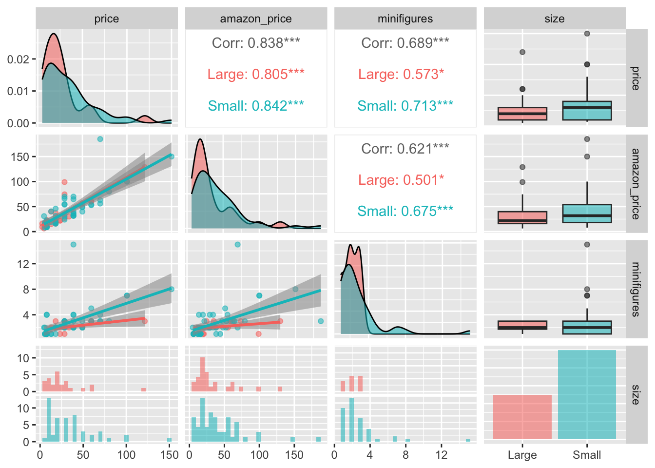
Adding transparency (alpha =) helps reduce clutter in the plot by making overlapping graphs easier to distinguish.
Below is another coding style to achieve the same result, which I prefer. It separates the column selection step from the plotting step, making the code easier to manage.
lego_sample |>
  select(price, amazon_price, minifigures, size) |>
  ggpairs(mapping = aes(color = size, alpha = .7),
          upper = list(continuous = wrap("cor", method = "spearman")),
          lower = list(continuous = wrap("smooth")))
Although ggpairs() is useful for exploring relationships between different variables (e.g., comparing test scores), it can sometimes become overwhelming with too many plots. If you’re unsure whether this approach is the best for your data, I recommend creating individual plots first (e.g., density or box plots) before mixing everything together. This will help clarify the relationships you want to explore and the most effective ways to visualize them.
8.8 additional features on the plot
8.8.1 labels
A good graph includes informative labels. While you could add titles, subtitles, and other labels in separate software after downloading the graph, it’s more efficient and reduces the chance of errors if you add all the labels directly in RStudio.
movies |>
  ggplot(aes(x = score,y = rating,  fill = rating, color = rating)) +
  geom_density_ridges(alpha = 0.6) +
  labs(
        title = "Movie Scores of Different MPAA Ratings.",
        subtitle = "Put your subtitle here because I don't know what to say.",
        x = "Movie Score",
        y = "MPAA Rating",
        fill = "Rating",
        color = "Rating",
        caption = "sources: movies from openintro")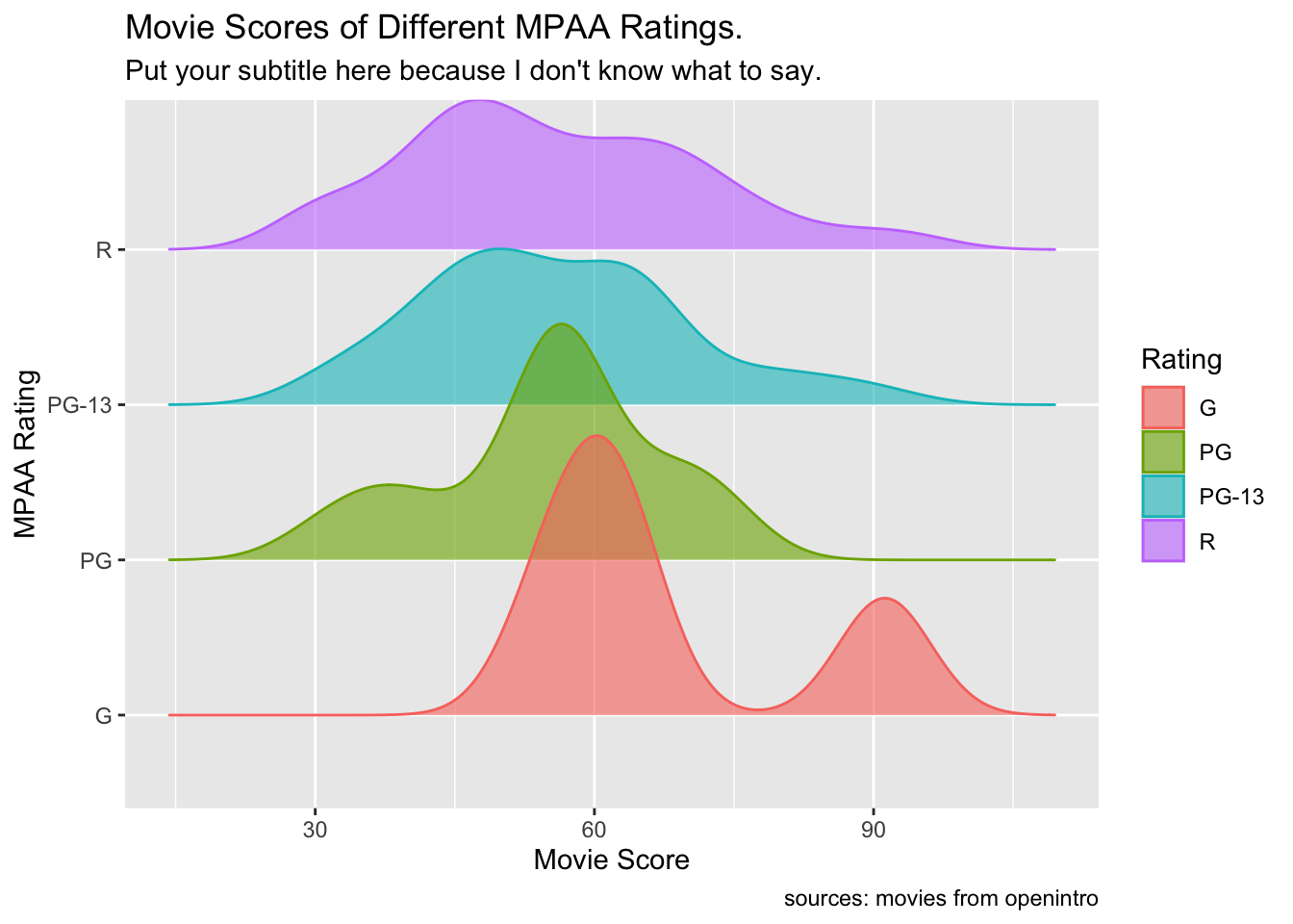
If you prefer not to show certain labels, you can aslo specify this in the code and let the program remove them for you.
movies |>
  ggplot(aes(x = score,y = rating,  fill = rating, color = rating)) +
  geom_density_ridges(alpha = 0.6) +
  labs(
        x = NULL,
    fill = NULL,
        color = NULL,
        fill = NULL)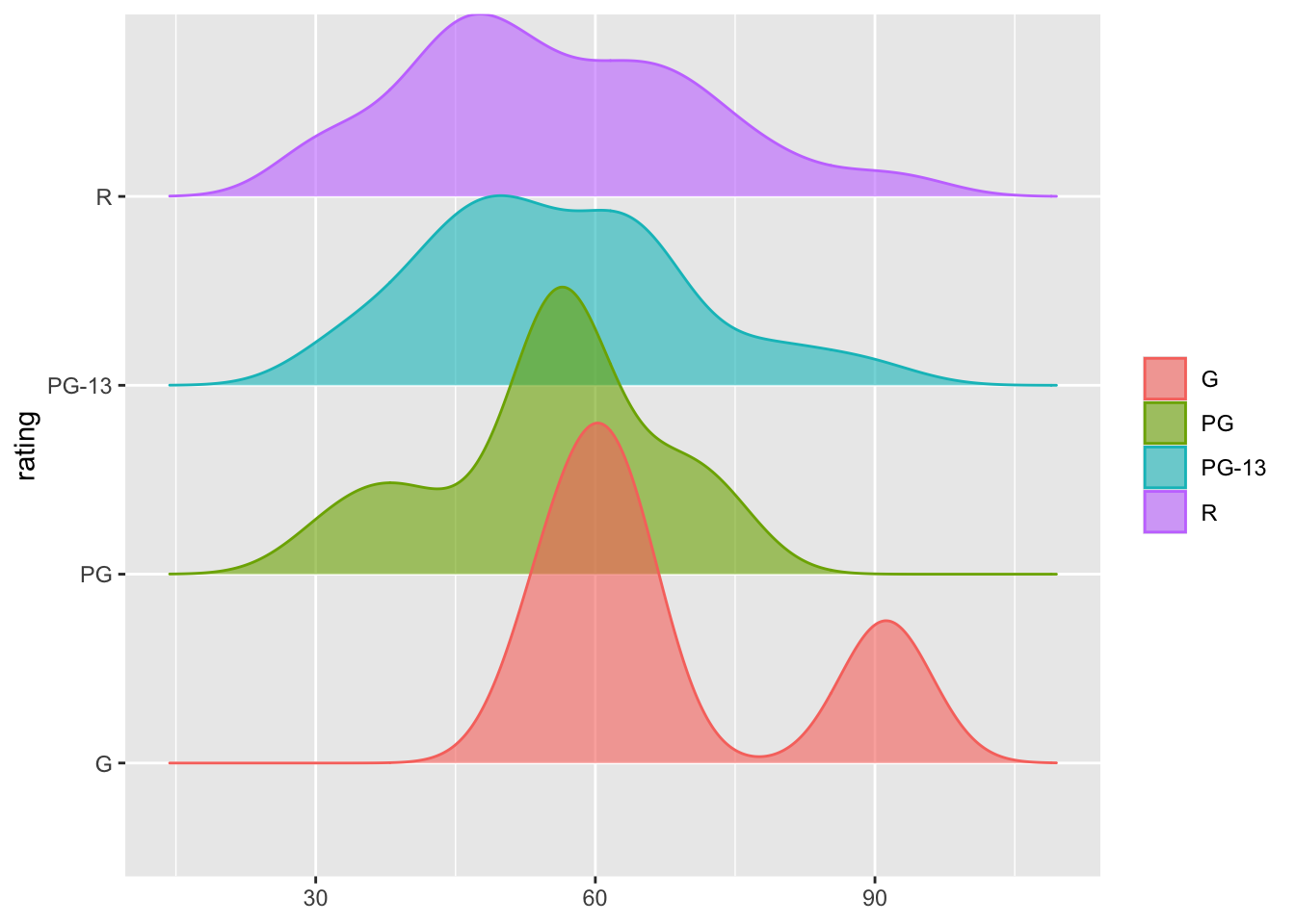
For example, in the code chunk above, when we set the x-axis to NULL, the label disappears from the graph. However, if we don’t specify the y-axis in the labs() function, the original label from the data will still appear.
Also, if you want to remove the legend, you can do so by adjusting the theme() function.
movies |>
  ggplot(aes(x = score,y = rating,  fill = rating, color = rating)) +
  geom_density_ridges(alpha = 0.6) +
  labs(x = NULL, y = NULL) +
  theme(legend.position = "hide")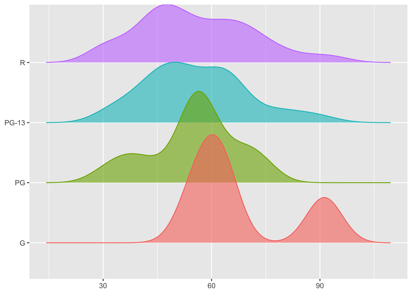
8.8.2 colors
Let’s demonstrate how to change colors in a graph with the lego_sample dataset!
lego_sample |>
  na.omit() |>
  ggplot(aes(x = size, y = price, fill = as.factor(minifigures))) +
  geom_bar(stat = "summary", position = "dodge")
For easier demonstration, we will focus on LEGO sets with 1 to 3 minifigures.
lego_sample |>
  na.omit() |>
  filter(minifigures <= 3) |>
  ggplot(aes(x = size, y = price, fill = as.factor(minifigures))) +
  geom_bar(stat = "summary", position = "dodge")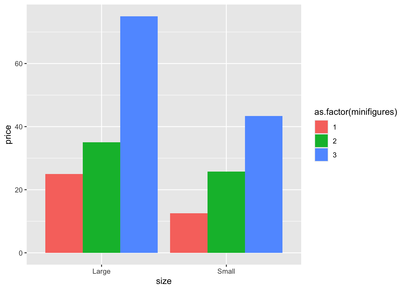
Now we’re all set!
lego_sample |>
  na.omit() |>
  filter(minifigures <= 3) |>
  ggplot(aes(x = size, y = price, fill = as.factor(minifigures))) +
  geom_bar(stat = "summary", position = "dodge") +
  scale_fill_manual(values = c("darkblue","yellow","pink"))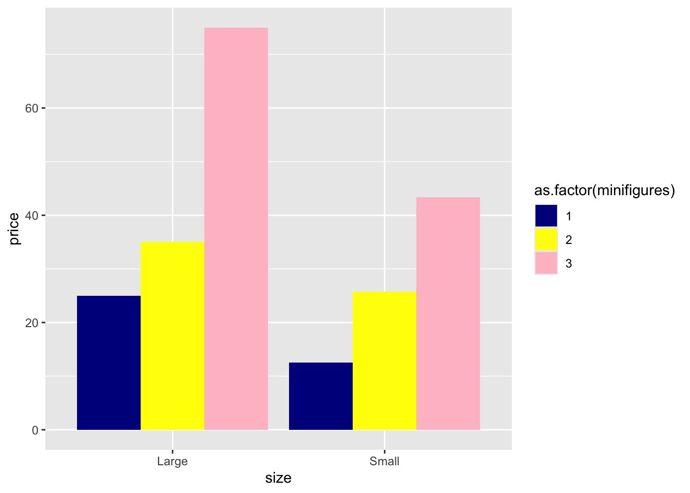
It’s as simple as that! Also, note that you only need to specify each color once. For instance, although the colors "darkblue", "yellow", and "pink" appear twice in the graph, we only need to type them once in stead of using values = c("darkblue", "yellow", "pink", "darkblue", "yellow", "pink").
If you don’t want to use default colors but don’t feel like manually selecting distinct colors each time, you can use pre-existing color palettes in RStudio.
You can also add outlines to the bars in the chart to make them pop up more.
lego_sample |>
  na.omit() |>
  filter(minifigures <= 3) |>
  ggplot(aes(x = size, y = price, fill = as.factor(minifigures))) +
  geom_bar(stat = "summary", position = "dodge", color = "black") +
scale_fill_viridis_d() 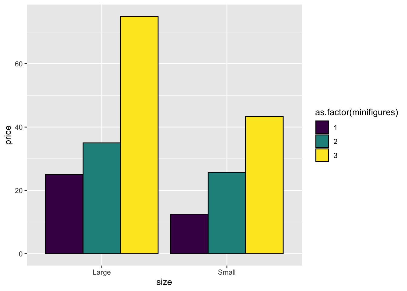
Note that we use scale_fill_viridis_d() here. If you’re using color = instead of fill =, remember to switch to scale_color_viridis_d().
lego_sample |>
  na.omit() |>
  filter(minifigures <= 3) |>
  ggplot(aes(x = size, y = price, color = as.factor(minifigures))) +
  geom_bar(stat = "summary", position = "dodge", fill = "white") +
scale_color_viridis_d() 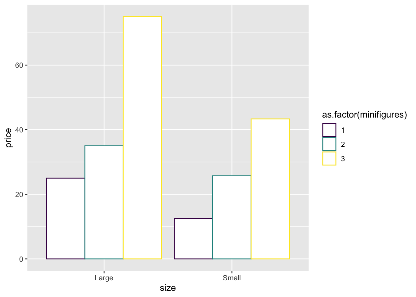
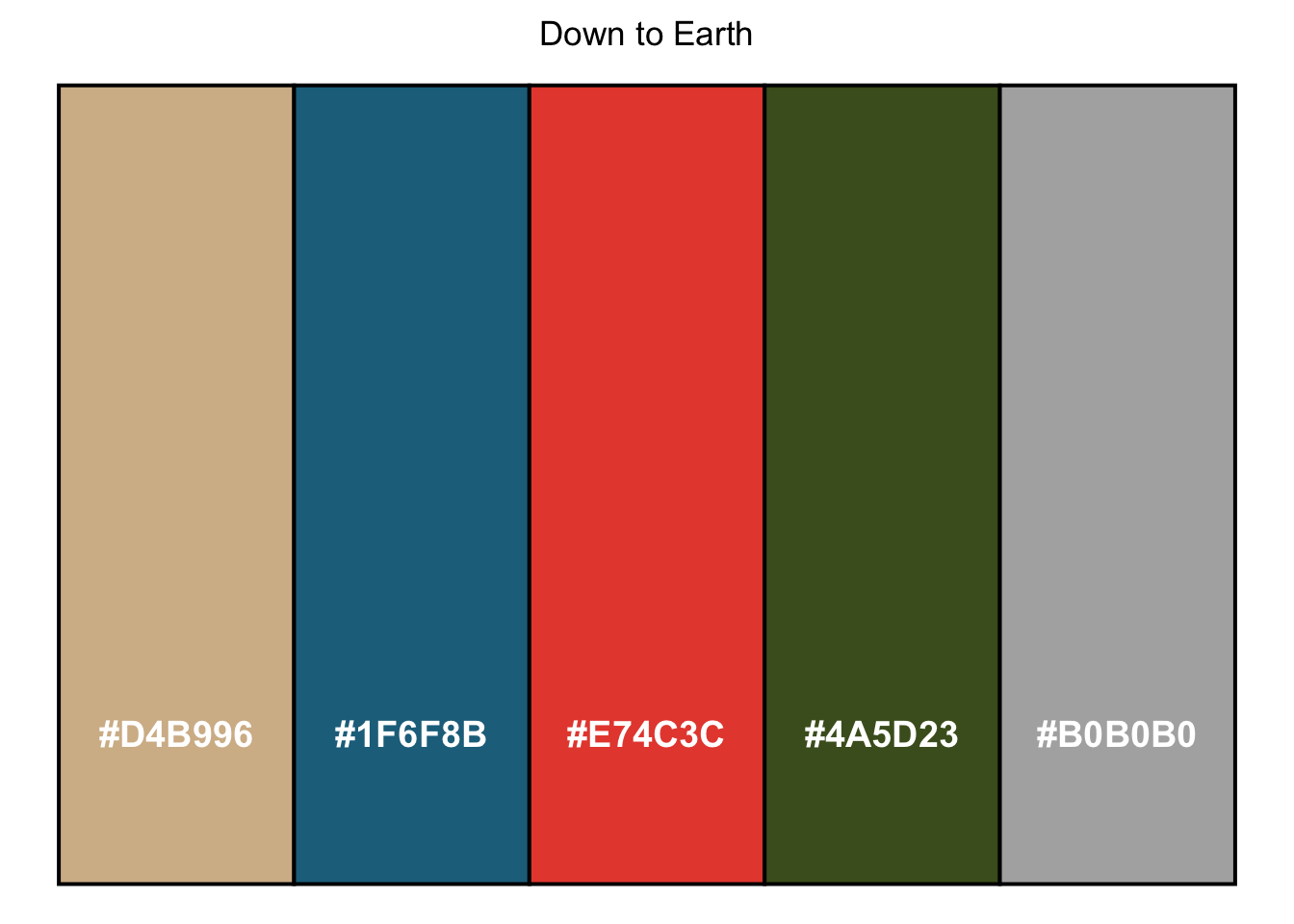
My frequently used color palettes
Down to Earth
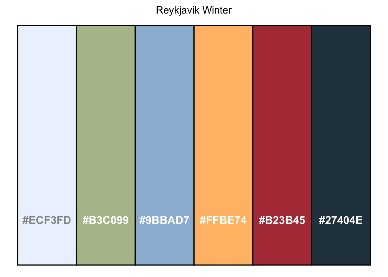
Reykjavik Winter
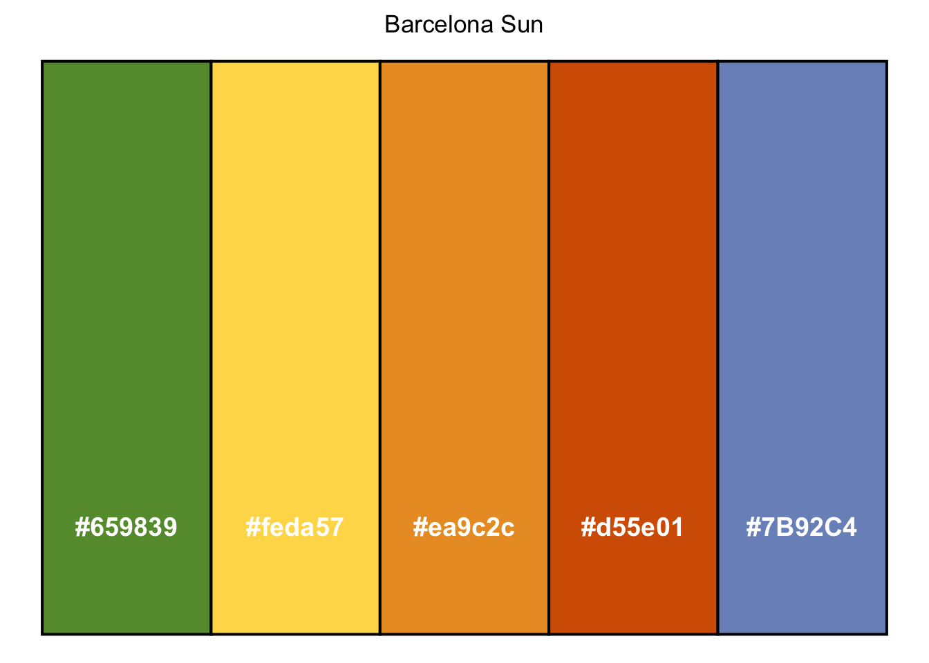
Barcelona Sun
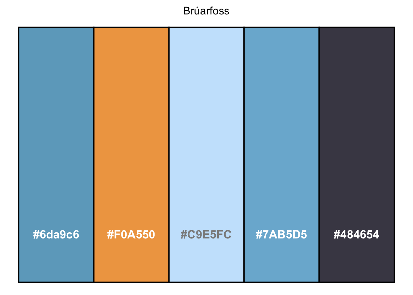
Brúarfoss
8.8.3 scales
Now, let’s look at some data from heroes2 dataset.
heroes2 |>
  filter(Intelligence %in% c("good", "high")) |>
  ggplot(aes(x = Gender, y = Strength)) +
  geom_bar(stat = "summary", position = position_dodge(.8), width = .7) +
  geom_errorbar(stat = "summary", position = position_dodge(0.5), width = .12) +
facet_wrap(Intelligence ~ ., scales = "free") 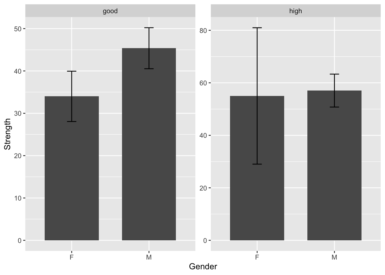
Take a quick glance at the chart. It seems like the good intelligence group has higher strength than the high intelligence group as the bar is higher.
But is that really the case?
Take a closer look at the two bar charts. The y-axis scales are different from one graph to another.
To verify, let’s calculate the average strength for both groups.
heroes2 |>
  filter(Intelligence %in% c("good", "high")) |>
  group_by(Intelligence, Gender) |>
  summarise(mean_strength = mean(Strength))
## # A tibble: 4 × 3
## # Groups: Intelligence [2]
## Intelligence Gender mean_strength
## <chr> <chr> <dbl>
## 1 good F 34
## 2 good M 45.4
## 3 high F 55
## 4 high M 57.0We can see from the results that in the good intelligence group, the average strength of both genders is actually lower than in the high intelligence group. However, without paying attention to the y-axis, we might have gotten the wrong impression that the good intelligence group had higher strength than the high intelligence group.
To fix this issue, we can manually adjust the scale using coord_cartesian(). You can choose to remove scales = "free" or leave it there. Since the code is applied in layers, if you add the manual scale after specifying scales = "free", the graph will be unaffected.
heroes2 |>
  filter(Intelligence %in% c("good", "high")) |>
  ggplot(aes(x = Gender, y = Strength)) +
  geom_bar(stat = "summary", position = position_dodge(.8), width = .7, fill = "#BDD5EA") +
  geom_errorbar(stat = "summary", position = position_dodge(0.5), width = .12) +
  facet_wrap(Intelligence ~ ., scales = "free") +
coord_cartesian(ylim = c(0,100)) 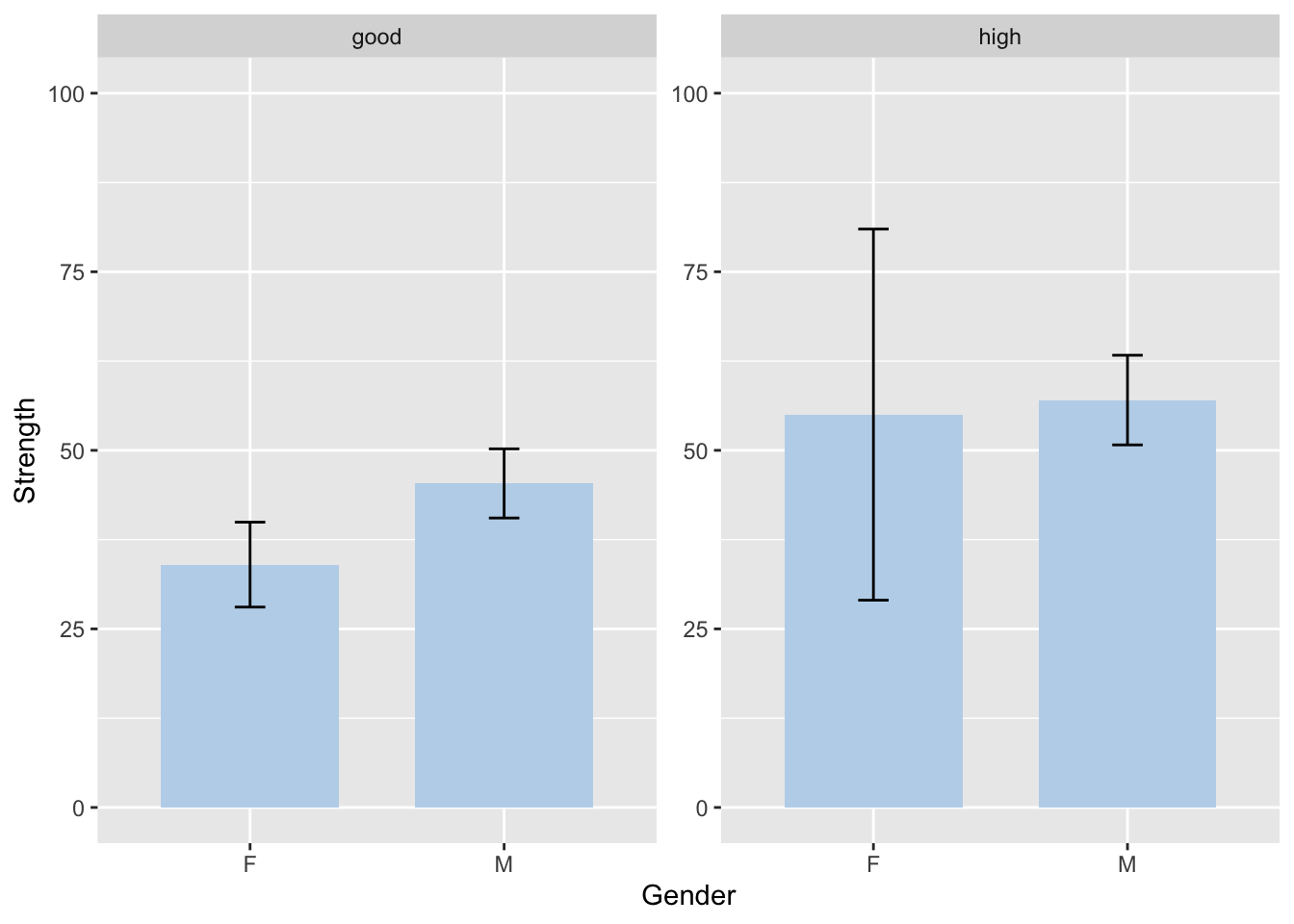
After setting the same scale for all graphs, it becomes much easier to compare them and observe relationships between variables.
You can modify the ylim() values based on your data.
8.8.4 themes
The theme() function allows you to change the overall appearance of your graph. Some commonly used themes are theme_classic(), theme_light(), theme_test(), and the default theme_gray().
8.8.5 significance levels
To be honest, before I discovered this function, I always pasted my graphs into PowerPoint and then used bars and star signs to manually add the significance levels to the graphs. It was super tedious and difficult, as I often accidentally moved the graphs easily.
Not to mention, I frequently forgot to leave enough space for the significance levels to be displayed on the graph, which required me to go back to the code and use coord_cartesian() to change the scale again and again.
To make matters worse, it is really hard to get the precise position, as I would have to draw multiple grid lines to help me align everything.
Now, these problems will vanish into thin air! I present to you the power of geom_signif(), which allows you to easily add significance levels (or anything else you want) to your graphs!
This life-changing function is from ggsignif package. Therefore, install and library the package first.
Let’s start by simply take a graph we already drew in the previous parts.
Here, we place the graph in a separate plot called lego_graph. While you can continue adding significance levels after the plot, I prefer to separate both functions for easier readability.
example 1: lego_sample
lego_sample |>
  filter(packaging == "Box") |>
  na.omit() |>
  ggplot(aes(x = theme, y = price, fill = theme)) +
  geom_bar(stat = "summary", position = position_dodge(.8), width = .7) +
  geom_errorbar(stat = "summary", position = position_dodge(.8), width = .12) -> lego_graph
lego_graph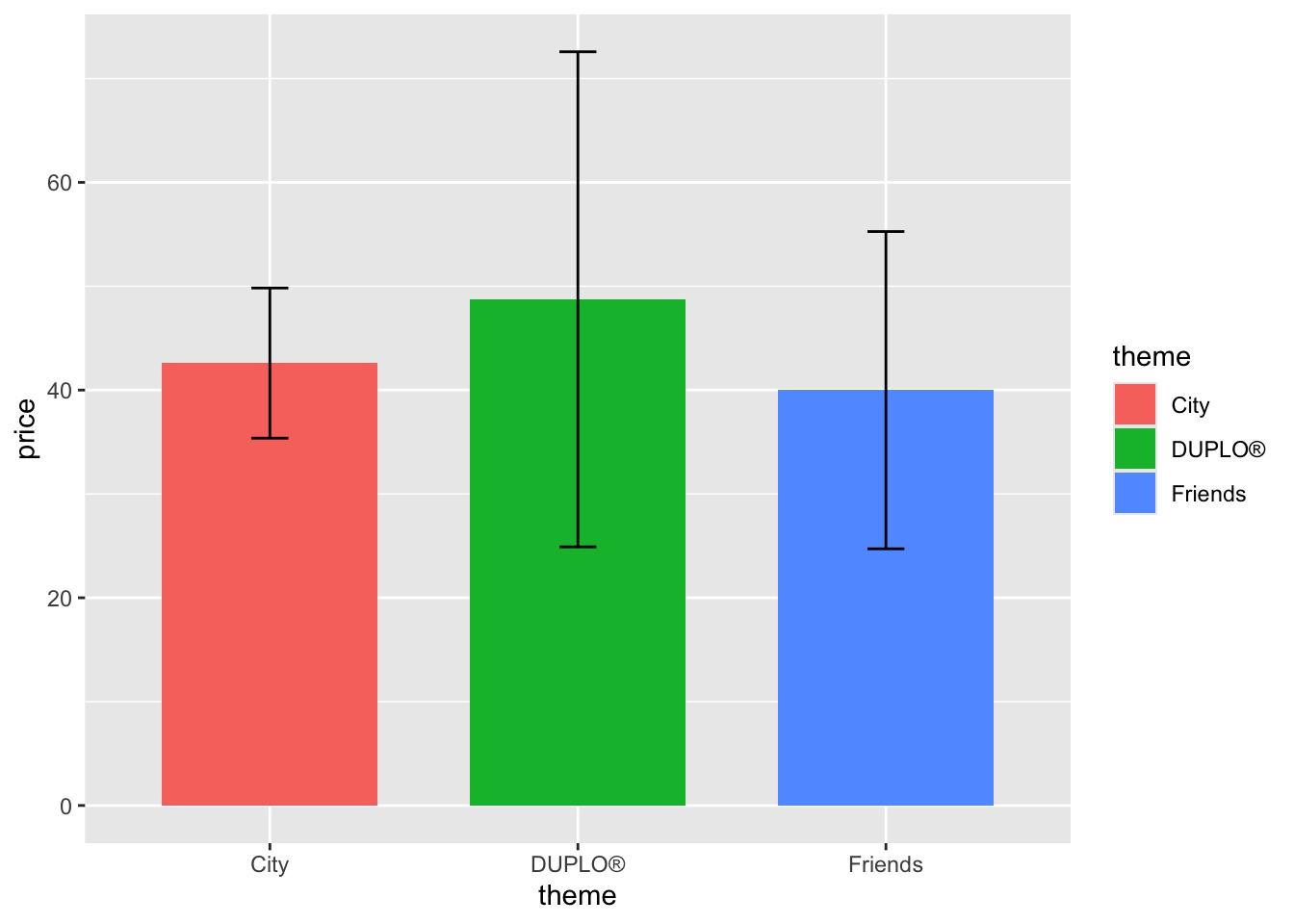
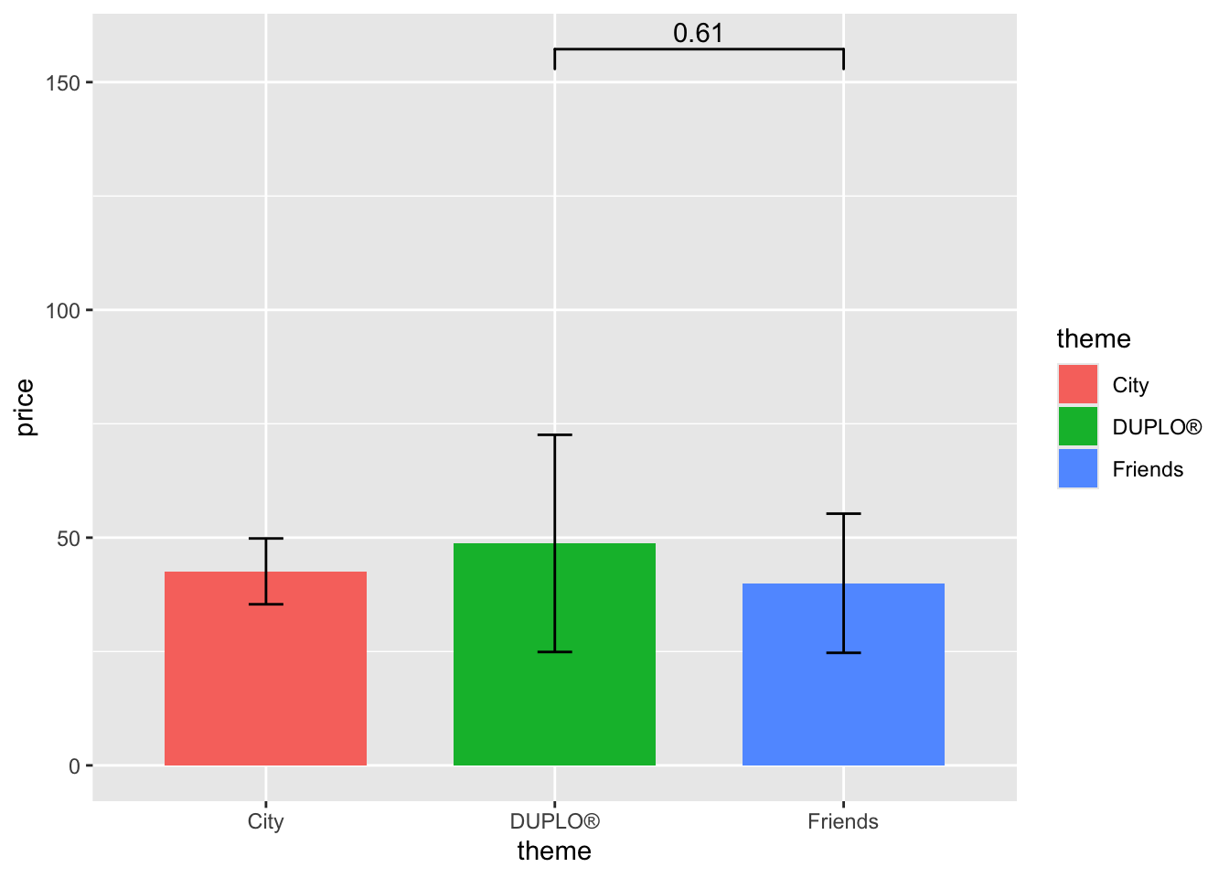
If I want to move the bar lower, I can change its position using y_position =.
lego_graph+
  geom_signif(data = lego_sample,
              comparisons = list(c("DUPLO®","Friends")),
y_position = 90) 
You can adjust the number by your need. Trials and errors are required in order to find the perfect position.
Let’s say we want to add another significance level.
lego_graph +
  geom_signif(data = lego_sample,
              comparisons = list(c("DUPLO®","Friends")),
              y_position = 90) +
  geom_signif(data = lego_sample,
              comparisons = list(c("Friends", "City")),
y_position = 73) 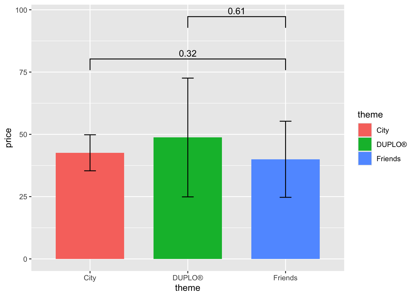
Note that it is highly advised to change the y_position between two bars, so that they don’t overlap and hinder the information.
If today you don’t want the numbers, just want “not sig” or other words you’d like, you can also modify that by using annotations.
lego_graph +
  geom_signif(data = lego_sample,
              comparisons = list(c("DUPLO®","Friends")),
              map_signif_level = TRUE, annotations = "not sig. :(",
              y_position = 90) +
  geom_signif(data = lego_sample,
              comparisons = list(c("Friends", "City")),
              map_signif_level = TRUE, annotations = "not sig. :P",
              y_position = 73)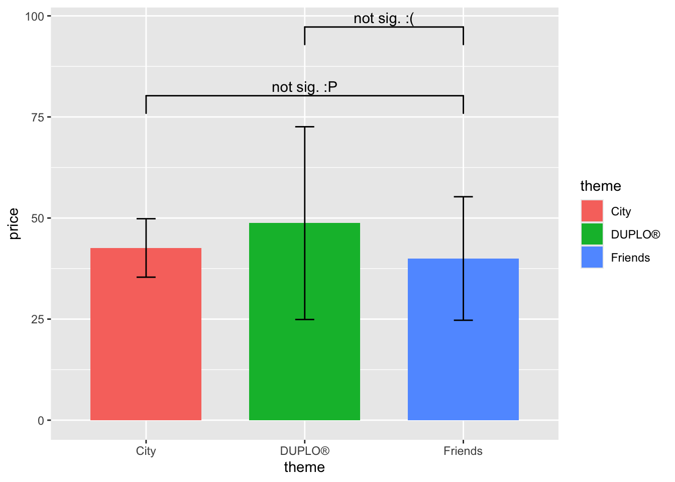
If your data is not significant, and you just want to add “NS”, then you could just remove the annotations part and leave the map_signif_level = TRUE.
lego_graph +
  geom_signif(data = lego_sample,
              comparisons = list(c("DUPLO®","Friends")),
              map_signif_level = TRUE,
y_position = 90) 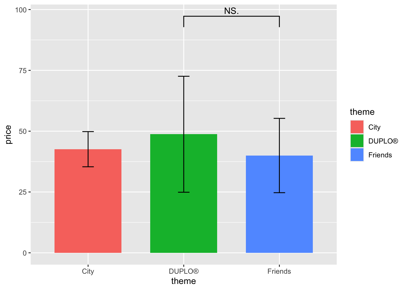
These labelling methods applies to other kinds of graphs as well.
However, if we type geom_signif into the Help panel on the right, we can see that the default they are using is wilcox.test instead of t.test. If, you are like me, used t.test more often, then we need to manually change the test type.
Take the heroes2 dataset for example.
heroes2 |>
  filter(Publisher %in% c("Marvel Comics", "DC Comics")) |>
  ggplot(aes(x = Gender, y = Strength, fill = Gender)) +
  geom_bar(stat = "summary", position = position_dodge(.8), width = .6, alpha = .8) +
  geom_errorbar(stat = "summary", position = position_dodge(.8), width = .2) +
  facet_wrap(~Publisher) +
  geom_signif(comparisons = list(c("F", "M")),
              map_signif_level = T,
              test = "t.test",
              y_position = 90) +
  ylim(c(0,100))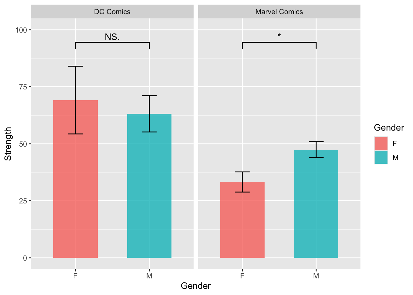
As you can see, by simply adding test = "t.test", we can achieve our goal.
What if you are dealing with multiple levels of data instead of just two? The only thing you need to do is to add more layers of geom_signif() into the plot.
lego_sample |>
  ggplot(aes(x = theme, y = price, fill = theme)) +
  geom_bar(stat = "summary", position = position_dodge(.8), width = .6, alpha = .8) +
  geom_errorbar(stat = "summary", position = position_dodge(.8), width = .2) +
  facet_wrap(~ year) +
  geom_signif(comparisons = list(c("DUPLO®", "Friends")),
              map_signif_level = T,
              test = "t.test",
              y_position = 80) +
  geom_signif(comparisons = list(c("City", "Friends")),
              map_signif_level = T,
              test = "t.test",
              y_position = 65) +
  geom_signif(comparisons = list(c("City", "DUPLO®")),
              map_signif_level = T,
              test = "t.test",
              y_position = 50) +
  ylim(c(0,90))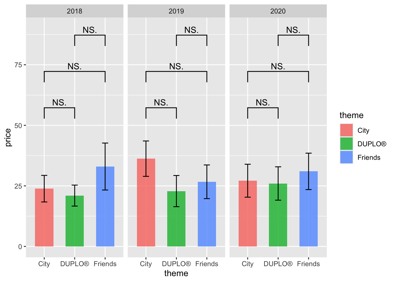
example 2: movies